Where is the Vaccinated Population?

Since the FDA authorized the emergency use of COVID-19 vaccines in the U.S., we have seen an increasing number of inoculations. Currently, there are three leading brands available, two that require two doses and one that requires one for complete protection. The CDC provides information on the number of doses delivered, administered, and those fully vaccinated for each brand since December 2020.
PolicyMap recently added this vaccination data from the CDC to our platform. The data shows the percentage of people vaccinated by state, who received one or two doses, and those fully vaccinated. Additionally, the data shows the number of doses delivered to each state, which could help policymakers in terms of distribution strategy and knowing the percent of the fully or partially vaccinated population. The map below shows the percentage of fully vaccinated people by state.
PolicyMap recently added each individual brand to our platform. The data shows the percentage of people fully vaccinated by each brand, and the number of vaccines delivered and administered by state. Now users can see which state’s population is receiving more of a certain brand or administering one or the other. The map below shows the percentage of fully vaccinated people from J&J/Janssen.
Some suggest using certain brands for specific populations. For example, J&J/Janssen is a single-dose that takes two weeks for immunity compared to five and six weeks for Pfizer and Moderna, respectively. Harder to reach populations could benefit from the J&J/Janssen vaccine because they won’t have to schedule a second dose. In West Virginia, they used it to inoculate the homeless, homebound, and those living in institutionalized settings. Similarly, in Pennsylvania, the Governor prioritized teachers and school staff to get kids back to school. J&J/Janssen shows evidence of reducing the risk of passing the virus asymptomatically to others, thus being invaluable to essential workers and those who may be unable to social distance. Due to the storage requirements for J&J/Janssen, it may be an ideal vaccine for rural areas because it does not need ultracold temperatures like Pfizer and Moderna and can last for three months in routine refrigeration. The map below shows the homeless population across the US. The two darkest purples on the map display the areas with the highest number of homeless people.
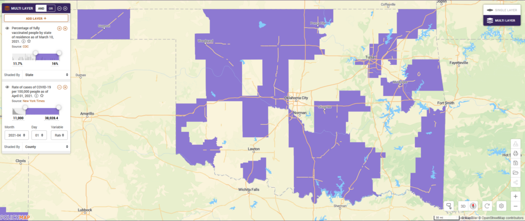
While the U.S has distributed over two hundred million doses, cases continue rising across the country. Using the multi-layer map tool on PolicyMap, users can overlay other layers of data to learn where cases continue to increase in relation to which states have the highest or lowest percent of vaccinations. Currently, North Dakota, South Dakota, Wyoming, New Mexico, Oklahoma, and West Virginia had the highest percentage of fully vaccinated people. When we overlay data on the COVID-19 cases from the New York Times, we see the rates of cases continuing to rise in some of those states, particularly in Oklahoma. By combining the two layers, we see counties with high rates of surrounding Oklahoma City and Tulsa and spread through rural areas.

Not only is the vaccination data interesting on its own, but combined with other indicators like health outcomes, medical conditions, internet access, or demographics, we can learn more about the communities most affected by COVID-19. While it still may be months away until we reach herd immunity, continue following PolicyMap for updates along the way.