Social Needs Index

Data
Social Needs Index
Source
Find on PolicyMap
- Analytics
- Opportunity Zone Resources
- Social Needs Index
A lot of data can be used to try to understand social need in communities: poverty, household income, and unemployment to name just a few. We recently added a new data layer called the Social Needs Index that combines several indicators commonly used to illustrate social need into a simple 1 to 10 ranking, with 10 being the areas of highest need.
The Social Needs Index was created by the urban research firm New Localism Advisors and shared with PolicyMap to be made available to premium subscribers. Though the index has a wide range of potential uses, it was originally made to help guide investments to Opportunity Zones. Jeremy Nowak, of New Localism Advisors, was a panelist on our recent Mapchats Webinar about Opportunity Zones, and used the index as part of his presentation.
Unpacking the Social Needs Index
The Social Needs Index incorporates five underlying variables:
- Population below poverty
- Households with rent or mortgages greater than 30% of income
- Population not in the labor force
- Population with less than a high school degree
- Gini index of concentrated income (a measure of income inequality)
The source data for all of these variables is the 2012-2016 Census American Community Survey. A factor analysis was used on the variables to create a weighted composite index of social need at the census tract level. Then, the tracts were ranked on a 1 to 10 scale relative to other census tracts in the same state.

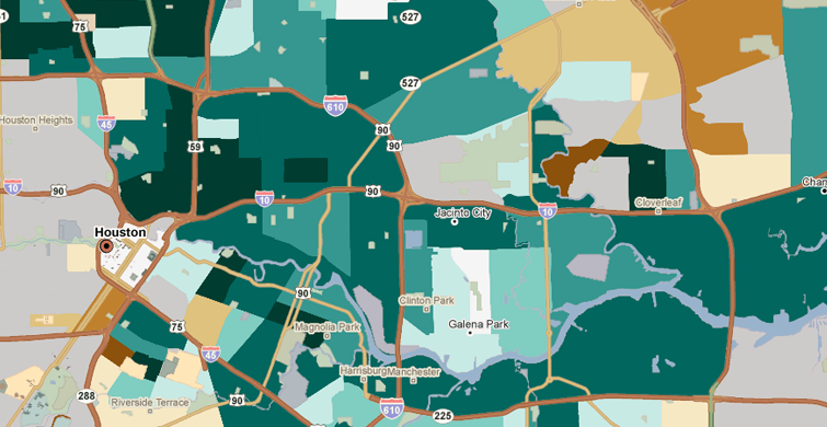
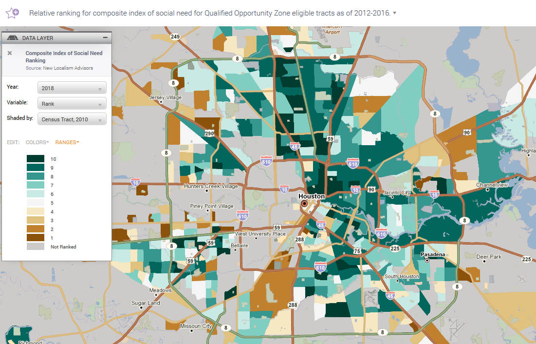
If we take a look at the map of the Social Needs Index in Houston, you will see that the tracts shaded darker green are those with a ranking closer to 10, indicating higher social need. These are tracts where the underlying variables demonstrate higher need (ie. higher poverty, lower educational attainment, etc.) relative to other census tracts in the state of Texas. A tract with a 10 ranking in Texas is not necessarily the same as a tract with a 10 ranking in Massachusetts. This relative aspect to the data can be helpful as it has some local context already built in to the rankings.
If you refer back to the map of Houston, you might ask yourself “Why are a lot of census tracts shaded gray with a value of Not Ranked?” This gets at another wrinkle with the Social Needs Index data. The 1 to 10 ranking was only determined for census tracts that were considered eligible low-income community (LIC) tracts for the Opportunity Zones program, which we’ve been talking about a lot recently. To be considered an LIC, a tract had to either have median family income at or below 80% of Area Median Income (AMI) or a poverty rate of 20% or greater.
The rankings were assigned only to LIC tracts because the index was specifically created to help inform the designation of Opportunity Zones as well as the eventual deployment of Opportunity Funds. This has a couple implications.
First, if you refer back to the Houston Social Needs Index map, tracts shaded darker orange have a lower ranking indicating lower need. However, while these tracts may be lower need relative to those with a ranking of 10, they are still communities that are considered low-income. Therefore, they are high need relative to moderate and higher income census tracts – those appearing with gray shading in the Social Needs Index data layer.
The second implication is that there is really even more built into this data than initially meets the eye because it also takes into consideration whether or not a tract is considered a LIC.
Using the Social Needs Index in PolicyMap
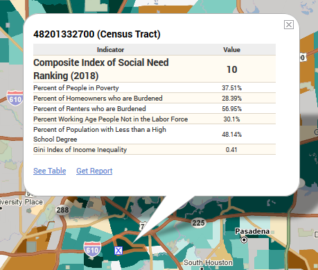
Some features have been built around the index to make it even more useful. When you select a tract on the map, you will see a custom info bubble that shows the Social Need ranking as well as the values for its underlying variables. This allows you to better understand why a tract is a 10 versus another tract that might be an 8. It also helps you better understand the area, since different 8s might be an 8 for different reasons. The custom info bubble and underlying variables also appear for tracts that are not ranked.

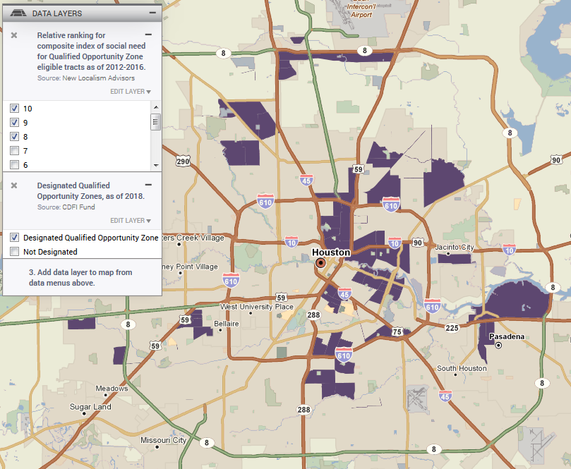
There are plenty of potential use cases for this data. Visualize where high need communities are, help inform resource allocation, understand where new investment could generate the greatest impact, etc. You could also use 3-Layer Maps to combine the Social Needs Index with other data layers to drill down on target areas. The example below shows census tracts in Houston with a Social Needs Index rank of 8, 9 or 10 (so just the highest need tracts) that are also designated as Qualified Opportunity Zones.

These are tracts where potential investors can take advantage of the tax deferral incentives of the Opportunity Zones program and where their investments have the potential to generate the greatest social benefit. Add additional data layers like jobs or home sale data to understand where there is already some market traction. And load your portfolio of projects or investment sites to see those that are located in tracts that meet all of these criteria.
The goal with data like the Social Needs Index is to package up a bunch of relevant indicators and variables into an easily digestible map layer. This data is available to premium subscribers, and is in the Analytics menu.