Interesting tool for viewing US census data

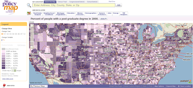
Policymap offers a slick, map interface for viewing US census data. Use it to check out your own neighborhood, or those of neighborhoods you are interested in.
Here is a map of the middle swathe of the US mapped by percentage of post-graduate degrees:
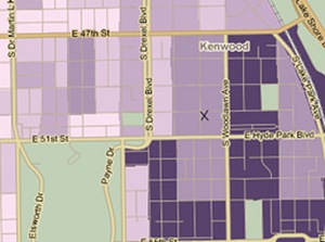
Here, Carl Bialik mapped Obama’s Chicago neighborhood (his home is marked with an X. The darker shading indicates a higher percentage of residents graduated college. Dark purple means more than 22.94% of residents have bachelor’s degrees:
Click here to read this article on Voice of Iyov on August 4th, 2008.

